Let’s design a navigation menu with Flexbox. I have spent this whole week and Sunday too learning and make this professional-looking menu using flexbox. Because new things/concepts take time to understand.

So without wasting much time let’s get started.
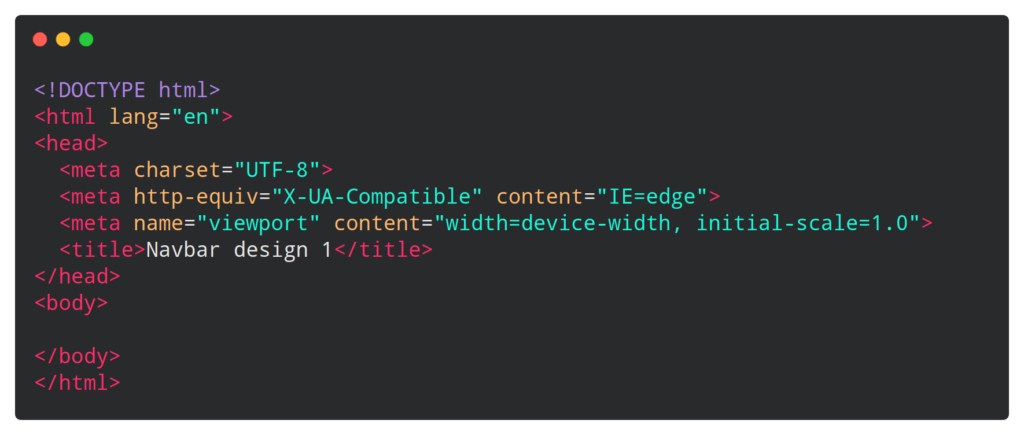
First of all open your code editor(Sublime Text 3) and create a HTML file with some basic HTML boiler plate which looks something like this.

Now we have to create our navbar skeleton, for that write this HTML code in your HTML file. Which looks like this.

In this HTML file we have just created a main header tag in which we have added image tag for logo, menu links and call to action button.
Now we will decorate our HTML navbar skeleton.
First of all i’m going to import a font, named “Montserrat” from Google fonts library in CSS file which looks like this.

Now you must have to remove default margin padding from this navbar HTML document, so to make that add this styling in your CSS file.

There is some common styling we need in our list tag, anchor tag and button(like font, color and text decoration) so we will design this all tag at once like this

In this CSS code we are applying font family “Montserrat”, font weight 500, font size 16px, font color “#edf0f1” and text decoration will be none which will hide the underline from links.
Now we will design Header tag

In header styling we are using display flex(FlexBox) to take alignment control on child element of header. justify-content will give space between all this child element like logo, nav links and call to action button.


Now we are going to give some styling to our logo and nav links. You can see logo cursor is set to pointer which will give pointer effect to our mouse cursor.
In nav link list-style “none” will remove underline from menu link texts.
Nav links li we have applied display “inline-block” will set all links in one line which is by default coming in three different lines and padding will set 0 padding from top bottom and 20px from left and right.
We set a (link anchor tags) to transition effect of all 0.3s ease 0s which will give smooth effect on hover color switch means when color change from first color to second color.
In last, on link hover default color will change to “#0088a9”.


In last we will give some beautiful CSS styling to our CTA(call to action) button. So the padding is applied 9px from top & bottom and 25px from left & right. Background color is set to rgba color. Border color is none because we don’t want border but we want rounded corner of button that’s why we have applied 50px border radius from all corner’s. Cursor pointer as you know it will give cursor effect on hover. And transition effect will give smooth effect of 0.3s ease.
For button hover we will just change button color.
So, Congratulations you have just learned how to make the professional looking navigation menu. Which looks like this.
You have just learned how to design navigation menu with flexbox
See the Pen Navbar design 1 by Atul Prajapati (@atulcodex) on CodePen.
By the way, I’m not a born web developer. I have also learned this menu design from skillsthrive youtube video, you can also learn to make this professional looking menu design from that video. Here it is.
Hey dear, if you are completed learning and practising all the steps, So congratulation you have invested your time to learn something valuable. Very few peoples are there who invest their time and effort to learn something, you can also waste your time by watching Netflix and some random YouTube video too but you are not that kind of guy. Keep learning, keep growing. And you can follow me on my Instagram @atulcodex where I share my skills and pieces of knowledge daily.


